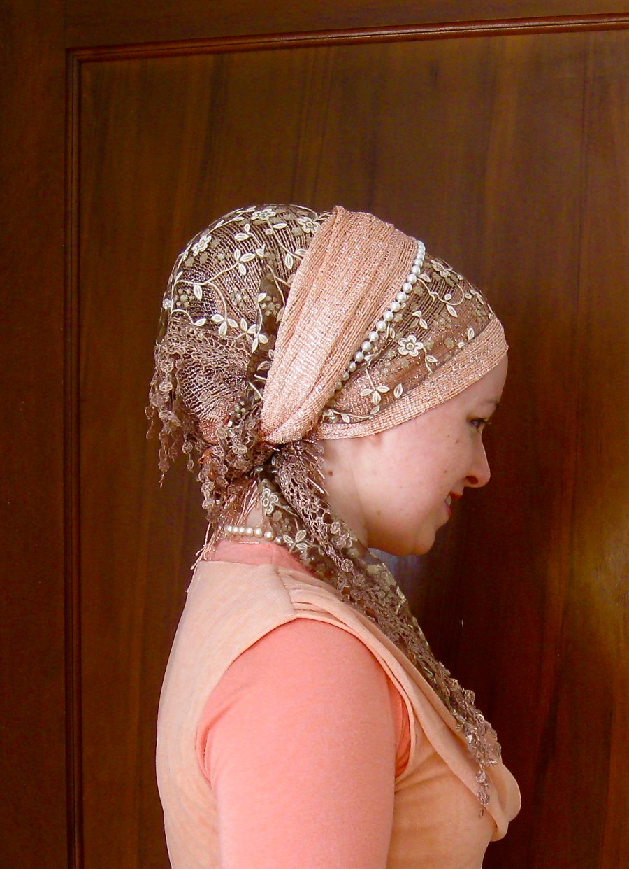
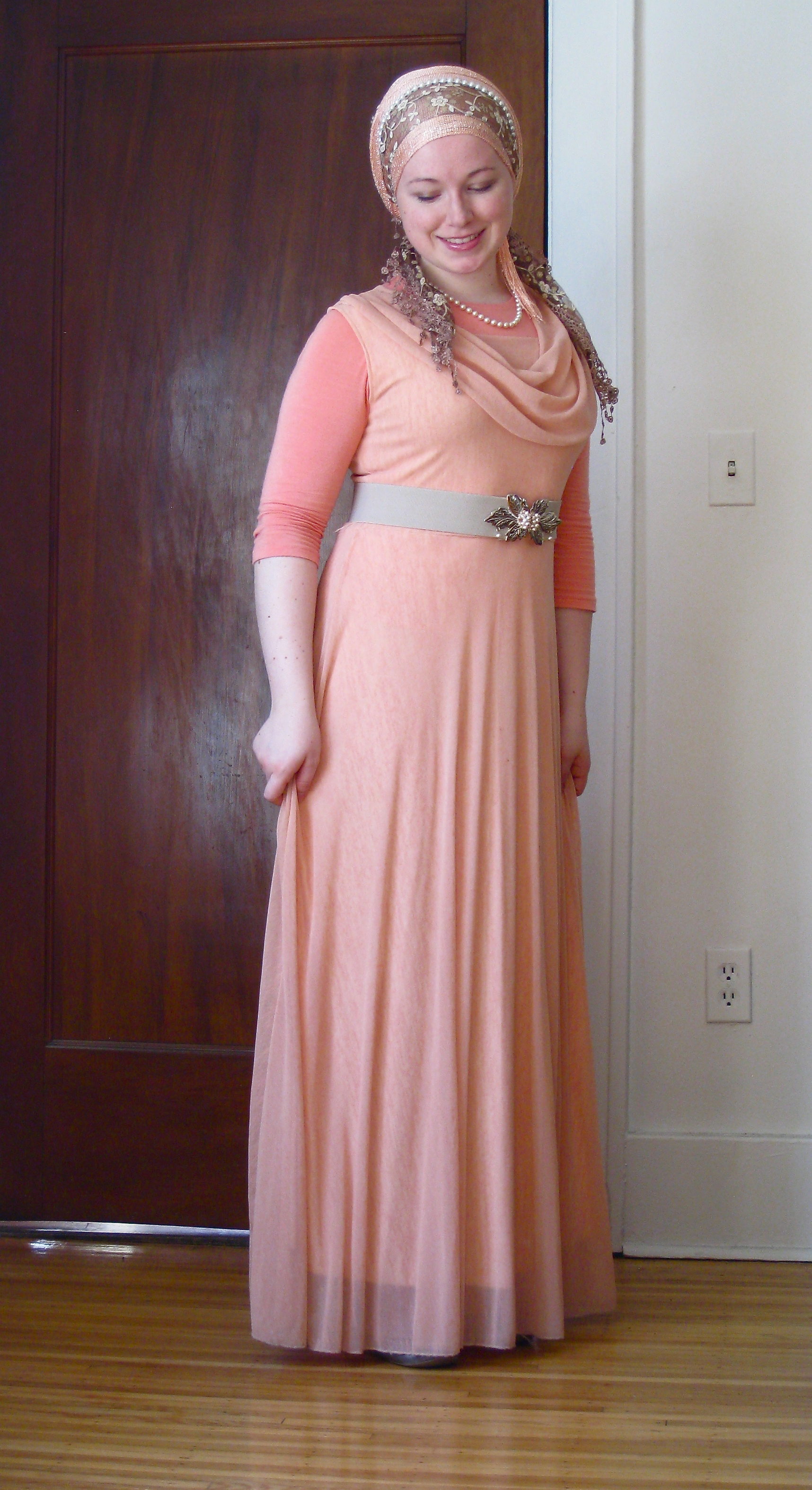
One of my very close friends just got married (yay!!), and I wanted to look awesome for her beautiful spring wedding. I LOVED pairing up this dress and tichel so much that I decided they deserved a full-length outfit post!
I’m a big fan of colors that make you smile and peach is a great one for this time of year! This gentle hue always makes me feel like it’s beautiful and blooming outside, even if I’m in freezing Chicago and just dreaming about better weather!
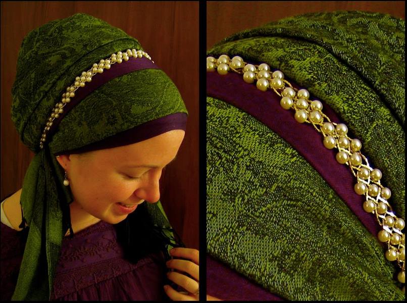
I wrapped a peach Shimmery as if it was a regal wrap, but left one end hanging. Then I tied a brown Dreamy Lace right on top, kerchief-style, and brought the other end of the shimmery over. Added some pearls with a regal clasp for extra shazam. VERY VERY easy, and I got so many compliments despite being one of only TWO tichel-wearers out of about 200-250 guests!
How do you like to wrap for fancy occasions? Have a favorite tichel combination, or tips for matching dresses? Share, share!!
Share share share!! Help others shine from the inside out!
Need to conquer the cold or beat the heat? Tamar Adina to the rescue! She’s back – with a great set of tips for ticheling to suit the weather (even when it can’t make up its mind). Enjoy!!!
Dear Wrapunzel,
Spring has sprung the grass is ris – I wonder where the flowers is?
-Adapted by unknown
Pesach is less than three weeks away. There. I said it. For those of you that are making Pesach, I just gave you full permission to begin the full on panic. Pesach, also known as Chag HaAviv is the first real sign (at least for me!) that warmer weather is imminent.
But… some years the warmer weather is a bit more imminent than other years. I live in a city where we’ve had years where there have been two inches of snow on the first day of Pesach. Did I mention that on that particular Pesach, the 15th of Nissan fell mid-April? We’ve also had years where it was a “frosty” 80 degrees Fahrenheit (27 degrees Celsius) in March…and we all prayed that the air conditioners were able to keep up with the demand of having an oven on during a cooking marathon.
So, what’s a girl to do when the weather runs the gamut?
Dress for the weather, of course!
Some of my favorite ways to wrap in cold weather include:
Wearing a thick pashmina like Popping Bubbles, Woven Vines, or The Cranberry. I combine that with a metal headband like Gold Roses (if I’m in the mood) and that’s it. During the winter, I don’t often wear my sari scarves or my 2-in-1s. I tend to wear only one really thick pashmina during the winter. On warmer cold days (yes, that’s a bit of an oxymoron, but we’ve had -33 and 25 degrees F (-36 and -4 degrees C) here; the later is downright balmy in comparison to the former) I’ll wear my Signature or a solid pashmina with a headband, the occasional silky sash, or lace. Yes, I’ve seen beautiful pictures on the fangroup where Wrapunzel ladies have managed to wrap a signature and a sari, but since I have a larger head and a ridiculous amount of hair I prefer less bulk. I VERY RARELY wrap a solid style pashmina with a second full size scarf.
Tucking my ears in. I cover my ears during the winter and I’ll keep a pair of earmuffs in my purse for extra protection.
Wearing a volumizer or at the very least, a cap. It adds an extra layer of warmth against the elements without adding bulk on the side of my head.
When the weather is warmer –
I bring out all of my medium and sheer scarves. In the springtime and fall I use and abuse my Shimmeries, saris, 2-in-1s and NY Brights. Those scarves all tend to go on hiatus during the winter.
I pack away my pashminas. And I’m not just referring to Popping Bubbles. I know that there are people that will happily wear the Ronit or the Signature year round…but I’m not that girl.
When the weather is somewhere between 40-75 degrees F (4-24 degrees C), I’ll often wear 2-3 scarves on my head (and frequently with a pin or second accessory.)
I still wear a volumizer or a cap because I like having a smooth “base” for my scarves.
When the weather is HOT –
I pack away the volumzier and just wear an oomphtastic scrunchy.
I ditch the synthetic based scarves. Fabrics made of natural fibers (cotton, linen, and even wool) help beat the heat while man-made materials can lead to a sweat drenching experience. Although 2-in-1s seem like the best option for heat, since those are made of viscose (aka rayon), the Wrapunzel Israeli tichel is actually significantly cooler.
I don’t wrap my ears.
But, what do you do when the weather outside…and the weather inside don’t match up? Although it’s annoying, there is sometimes anywhere between a 15 and 80 degree variation between the temperature outside and the thermostat inside. Like all good Midwest girls, I learned from a young age that sometimes you just have to layer. I’ll sometimes throw a second tichel into my diaper bag or briefcase and rewrap at work or after shul before walking a mile to lunch.
Whether or not you are making Pesach, I hope that you are able to take full advantage of the early sunshine!
Tamar Adina
[all photos belong to Tamar Adina]
Share share share!! Help others shine from the inside out!
The wrap is similar to the “Waterfall Rescue” tutorial that Naomi Rose did but with only one scarf and a variation… who would have thought that the original “Waterfall Twist“ tie would get so much attention! Rock it, wrap stars!
Share share share!! Help others shine from the inside out!
When I made the Lovely Lace tutorial yesterday, someone mentioned that it was hard to see how to do the “Loopy” part because my hands were in the way. So since it’s actually a tie that you can do on its own (I love doing it with the Lakeshore Bliss) here is a detailed tutorial on how its done! You can see that even though I’m blabbering away and doing it very slowly , it still only takes 2 minutes for the video! You’re gonna love this trick!
Share share share!! Help others shine from the inside out!
Good Morning! We’ve received so many requests for the Lovely Lace tutorial since posting this photo of Deidra on our facebook page yesterday! So while getting dressed this morning I decided to video myself trying it out! It’s so easy! You’ll also learn how to do the lovely “loopty-doop” on the side!
Share share share!! Help others shine from the inside out!
Sometimes, a busy day calls for a perfect one scarf wrap; a Regal Wrap done with a Tapestry Luxe (this is the Blonde one) fit those requirements perfectly! And I can’t believe how many compliments I’ve gotten when getting ready only took 2 minutes!
You know how I’m always talking about that ‘must have’ go-to wrap that we all need to master? Well, this is mine! Whenever I’m in a rush or my so called ‘genius’ creative idea isn’t working, I always go for this wrap. It’s foolproof once you master it! Do any of you have a go to wrap that you can just do in your sleep?
Love, Andrea
Share share share!! Help others shine from the inside out!
It’s been years since I made this video, and I’ve always been meaning to remake it. Here is part one of the remake!
Here I discuss one of the reasons why I love covering my hair: the intense multi-level pleasure that I get from it! Learn about the different kinds of pleasure we can experience in this world, and why hair covering allows me to start my day connecting to all of them!
Share share share!! Help others shine from the inside out!
Check out this awesome trick! Great for anyone that gets annoyed with having too many knots at the base of the neck! This will change your tichel tying game!
Share share share!! Help others shine from the inside out!
It seems that spring has finally sprung here in Baltimore! (Praying that it lasts!) I love spring for its energy of renewal, rebirth, the rediscover of potential. There are so many wonderful holidays that we celebrate that have the energy of spring:
Purim – allowing us to reveal the hidden
Pesach – enabling us to cast off our chains and grow towards our full potential
I am just so excited to be a part of all this! And here on the Wrapunzel front we are also working hard in the springtime! We are currently launching our new spring line, and we are truly inspired by the potential of these new tichels and accessories! Here are some photos of what we’ve found for you so far! Get excited… there’s more to come!
What are you looking forward to most about spring?
Share share share!! Help others shine from the inside out!
In it, she’s wearing a purple 2 in 1 and a Lakeshore Bliss in Green, a color combo rarely seen! What resulted was an IMMEDIATE snowball effect! We all had to try out this gorgeous color combo! It started with a few ladies…
And then more jumped on the bandwagon… we tried it with different scarves and sashes too!
Finally I had to join in as well! I had been looking for the perfect excuse to break in my purple lace sash… and don’t worry, even though this color is sold out right now we are getting more in!
Thank you Naomi Rose for clueing us in to this gorgeous color combination!!! Love it love it love it!!
Share share share!! Help others shine from the inside out!
The reason is that I usually end up giving them to ladies that I end up Wrapunzeling unexpectedly… and that often happens in shows, formal events, and public washrooms! So it certainly helps me keep my collection manageable.
Never have we carried a scarf that I’ve loved enough to want in all colors… until now.
It’s love!
The Tapestry Luxe is awe-inspiring. We first carried it in grey, as a fancy neutral scarf for the elegant and subtle ladies. Then we saw it in Blonde and just had to share it with you as well. Soon after our jaws dropped when we saw the Auburn… now THIS one was my favourite! Oh wait, but I love the blonde and grey too… so why choose? And then we got it in purple.
Basically, I am not going to choose which one I like most, because it’s always the one I’m currently wearing! This is definitely a thick, cooler weather scarf, but it’s so so soft. And the different sides of it (there’s the colorful side and then the gold side) make for so many different wrapping options! I just can’t get enough!
I’ve paired it with a cream&gold Braided Wreath Necklace (made into a headband with the Regal Clasp, of course!) – but usually I just wear it on its own! Here is a tutorial on how to wrap this scarf!
Hope you’re all doing well and if you’re in the cold/icy weather like I am, staying warm and safe!
Kol tuv,
❤ Andrea
Share share share!! Help others shine from the inside out!
The Star Trek character Spock, played by Leonard Nimoy who passed away last week, has had a profound impact on my life. Thank you Mr. Spock and Leonard Nimoy for helping for teaching me how to live in the paradox of this world. Here’s the story:
Share share share!! Help others shine from the inside out!
Here’s Tamar Adina again, with great ideas for Purim costumes and also some essential safety tips for you and your family to ensure that you have the happiest Purim ever!
Hey Wrapunzel!
Purim is coming up, and as a professional face painter and make up artist, Purim (and Halloween) are two holidays where I have a lot of experience and a lot to say.
Face Painting by Tamar Adina
First of all, there are SOOO many exciting costumes that allow you to fully cover creatively!Cheap costume wigs, veils, baseball caps, helmets…So let’s get started.
Girl with a Pearl Earring
Perhaps one of the easiest hair wrapping costumes is The Girl With a Pearl Earring.I wish I could claim that the popularity of this costume arose from Johannes Vermeer’s enigmatic painting: Girl with a Pearl Earring, but that’s not quite the truth. For anyone that has been living under a rock and away from all media influence (you LUCKY person!), the protagonist in this bestselling novel (and major feature film) is none other than that particular subject for Johannes Vermeer’s enigmatic painting: Girl with a Pearl Earring. The oil painting features a young, European girl wearing a very Wrapunzel-esque tichel and (drumroll) a pearl earring.The reason that I say “drumroll” is that the pearl earring is actually a subject of debate among scholars – it might actually be a tin earring.
Rock this costume with a light blue lakeshore bliss and a taupe 2-in1, a white shirt, a brown jacket, and an oversized earring.
Renaissance Hair Covering
Next on the agenda – the Renaissance costume.
Although at first glance it appears that Renaissance costumes all feature women with corsets, plunging necklines, and a gold circlet, the truth is that those are the sexy-Halloween versions of those costumes.More traditional Renaissance outfits come complete with hair coverings.Mimic these looks by trying Andrea’s video for a Princess Wrap (which is one of the older, original, Andrea wraps).Pair it with one of the new Wrapunzel lace!
Princess Leia
If historical costumes aren’t for you, try a Star Wars Princess Leia double bun done with a pashmina! While Wrapunzel doesn’t have an example, Nye’s Old Channel made an awesome tutorial for that! (I would actually move the buns so that they’re not perfectly covering your ears and so that you can hear what is going on around you!)
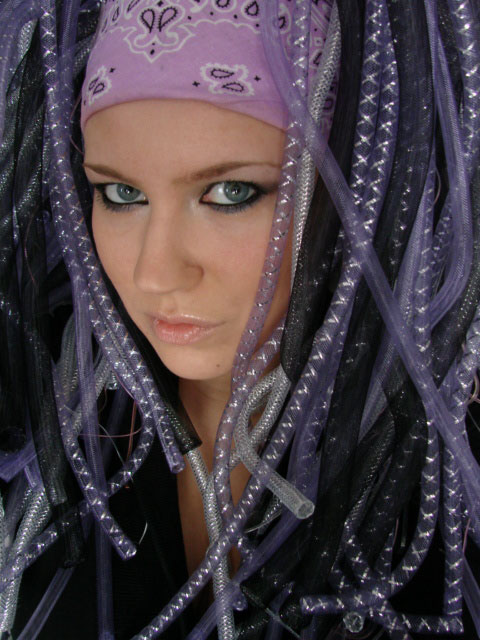
Cyberlox – picture of Erica Campbell, Owner of Erica’s Funny Faces
If Star Wars isn’t your thing and my other options are also not for you, try cyberlox! What are cyberlox? Cyberlox are synthetic dreadlocks that are MEANT to look like random pieces of technological tubing.These hair pieces can be made of plastic tubing, tubular crin, rubber and foam strips, and event belts.Traditionally, cyber lox slip around a ponytail.But…for those of you that don’t want a partial covering (and don’t have an abuse-able ponytail sheitel), this tutorialgives a full explanation using a wig cap.
But most of this post is actually not going to be about hair covering (sorry folks!).See, while most of the costumes and themes (yep, themes, for those of you that are looking at me in confusion, some people have wayyy too much time on their hands and they manage to create a yearly theme that ties their families costumes and their food packages together into one neat and hilariously rhymed poem) that I’ve seen are rather cute, I’ve also seen a lot of costumes that are downright dangerous.Most of the time, people don’t even realize that a particular costume quirk can be a HUGE safety issue!So, today’s blog post includes a list of safety considerations for you and your children.
If you have any questions, feel free to contact me! I can usually be found lurking on Facebook…
Clothes:
Prevent falls by shortening overly-long skirts, pants, dresses, veils, tails, and anything else that can trail on the ground.
Many costumes come with small detailing or accessories that can be hazardous to young children.Infants and toddlers should not wear costumes with removable detailing.
Shoes:
Choose safe, sturdy shoes for children; ditch the high heels or too-big adult sized shoes.Cheap, plastic costume shoes may look adorable, but they can serve as tripping hazards.Purim is too special to spend in the ER.
Accessories:
A long cape can be a serious choking hazard.Even a short cape can cause choking if it is stepped on while someone is walking down a flight of stairs.Minimize that choking hazard by making a cape that has arm loops to keep it in place instead of a tie that fastens around the neck.
Avoid overly-floppy hats.I know, they’re cute, but they limit a child’s field of vision and thus pose as tripping hazards.Don’t wear one for yourself either.They can interfere with driving, and even if you are not planning on getting behind a wheel, they can prevent you from seeing things in your peripheral vision.I’m going to be honest, there are sometimes inebriated drivers on the roads on Purim, you do NOT want to limit your ability to see a car coming towards you.
If your child is carrying a wand or sword, it should be made from cardboard or flexible rubber – not metal or hard plastic.The key here is to avoid anything that has sharp edges.
Most parents already know to avoid peeling paint on house walls and they already worry about lead tests for their children, but walls and water are not the only things that can be contaminated. Unfortunately, all that glitters is NOT gold as far as jewelry is concerned.But lead is not the only problematic ingredient that can infiltrate accessories.Inexpensive metal jewelry, like the kind found in discount and dollar stores, are frequently high in cadmium, a heavy metal that can cause severe health problems if absorbed into the body. It is important to avoid childhood exposure to cadmium, and there is no way to tell just by looking at a piece of jewelry if it contains cadmium.The best advice is to keep inexpensive jewelry away from children younger than six.Should you be scared of the necklaces and bracelets sold in mid-range retailers?Well, federal law limits the amount of cadmium that is allowed to be present in children’s jewelry.
But…as an extension of that, while fake tiaras and bangle bracelets are cute, if the jewelry isn’t “primarily intended” for kids 12 and under, it’s an adult product – and adult products have no cadmium restrictions.
Avoid the use of fake teeth (such as vampire fangs) by children under age 5.They are a major choking hazard.‘Nuff said.
Masks:
Masks can cut off a child’s peripheral vision.If your child insists on a mask, make sure that it offers good ventilation and that the peepholes line up with your child’s eyes.
Face paint: (alright, this one is a topic that is near and dear to my heart)
Face paint is a great alternative to masks, provided that it’s SAFE face paint.
FDA Compliant Face Paint
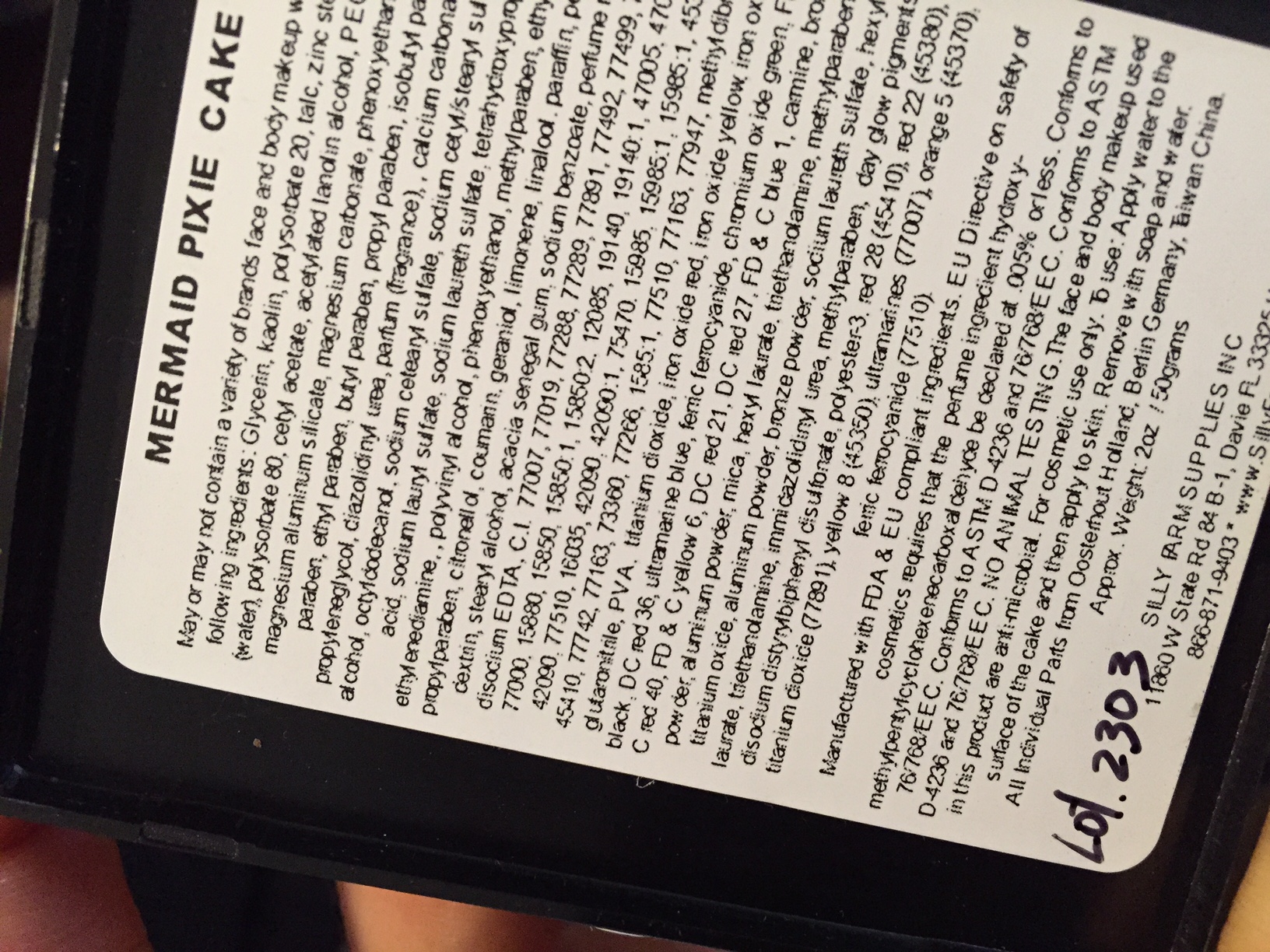
Face paint needs to be cosmetic grade.End sentence.“Non-Toxic” does not mean “safe for skin.”Even the words “safe for skin” and “hypo-allergenic” are meaningless where face paints are concerned. The only language that you must always look for in face paints is “FDA (Food and Drug Administration) compliant ingredients for cosmetic use.”There are no actual cosmetics that are approved for use by the FDA.(If someone tries to tell you that there are, they are full of beans.I digress though, moving on).
Acrylic craft paints are not meant to be used on the skin – nor are watercolor paints, pencils, sharpies (yep, I’ve seen teens with sharpies smeared all over their faces!) or markers.In addition to the long-term complications from using these materials, many people are allergic to the chemicals and colorants used in craft paints such as nickel, soluble cadmium, and formaldehyde. As an equally exciting side effect, “homemade” face paints made from lotion and craft paints are sometimes photo-toxic, and a child can wind up with a miserable chemical sunburn.
Avoid the dollar store or party store tubs of liquid face paints or the waxy crayons that are made in China.Those tend to be made of highly irritating ingredients.(You would not believe some of the pictures that I’ve seen of reactions!) Plus, whenever the media discusses a recall on face paint due to some type of contaminant, 99.9% of the time they are referring to these things!
So what should you use?Honestly, there are a large number of legitimate face paint products on the market.Ben Nye, Cameleon, Diamond FX, DIPS, FAB, Global, Graftobian, Kryolan, Kryvaline, Paradise, ProAiir, Ruby Red, SillyFarm Rainbow Cakes, Snazaroo, Starblends, Superstar, TAG, Wolfe FX….which one is good? They are ALL good!Most of those brands can be bought online, in local costume shops, or sometimes Snaz can be found in Michaels/Jo-Ann craft stores.If you cannot get your hands on any safe face paint and your child desperately wants to be a cat, consider either calling a professional face painter, or hitting up the drugstore for eyeliner pencil or eye shadow.Those two products can frequently get a very small whisker and pink nose done.Do yourself a favor though – face paints are primarily water based and will wash off easily with soap.Adult makeup tends to require additional scrubbing.And whatever you do, make sure that the pencils that you grab are not waterproof!
The skin is the largest organ of the body, and it can be an entrance for germs and bacteria; do not place face paint over an open wound or scab.By that same token do not just whip out your eyeliner and draw on your child’s nose, and then touch up your Cleopatra eye makeup.Doing so is a phenomenal way to wind up with an eye infection.(child’s mucus + your eyes = well…you get the picture).Break the point of the pencil, dip in alcohol and re-sharpen the pencil.
Nix the face paint if you or your child suffers from eczema or other skin conditions.Reactions are NEVER worth it.