Are you ready for another awesome color article by Tamar Adina? Here she helps us sort through terms like warm/cool/hue/shade etc., so we can figure out why that purple tichel looks awesome on one person, yet that other purple which is almost the same doesn’t work as well. Enjoy!
~*~
~*~
Hey Wrapunzel!
I’m back!
And I’ve been getting a lot of questions in my inbox. It seems like most people have heard about how certain colors look better (or worse) than others, but that one favorite blue tichel can be THE. PERFECT. COLOR but another blue just doesn’t seem to work. So —
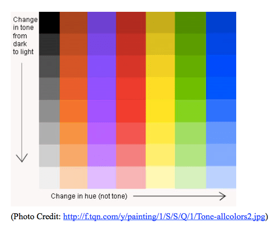
Lets get some terminology down. We throw around the terms hue, tint, tone, and shade, but each of these words actually has a fairly specific meaning. The word hue means any color on the color wheel. Tinting, shading or toning, can then alter every individual hue on the color wheel.
First up, a tint is sometimes called a pastel. Basically it’s simply any color with white added. Our second term, a shade, is simply any color with black added. Lastly, tones refer to adding gray to a hue. So in painting terms, tone actually refers to how dark a hue on the color wheel is rather than the actual color. A little trick to seeing the actual tone of a color (or a photograph) is to knock it grayscale on a computer. You will instantly be able to check the tone!
Still with me?
Good, because before I get much further, why is color in a wheel? Why can’t we have a color box (I helped myself to a nice box for tone!) Why the “wheel?” In answer, supposedly all other colors are created by mixing three primary colors in certain proportions. In particular, mixing equal quantities of each pair of Primary Colors produces the Secondary Colors (orange, green, and purple).
I say supposedly because I have a confession to make. See…
Unfortunately, that’s not how color actually works.
Processing color actually has to do with the visible electromagnetic spectrum, the brain, and lots of scientific stuff that gets way too long for this blog post. (Darn human physiology it’s always soo complicated to explain).
But, there are ways to counter the fact that the color wheel you were initially taught is a little more messy:
Rule number 1: there’s another version of the color wheel that artists tend to use.
And it has four primary colors.
(Preschool teachers everywhere just looked at me in horror.)
Yes. Four. Not the three that all little kids are taught. Four. Red, yellow, blue, and GREEN.
And on that wheel, all colors have a true, a warm, and a cool version.
Wait…WHAT?!? Tamar! First you confuse me by telling me that there is a fourth primary color, then you tell me that there are ‘warm’ blues when you wrote in your last post (LINK to last post) that blue in itself is a cool color!
Yes…I know…don’t kill me.
Rule number 2: color tones refer to GRAYSCALE but in makeup world, when people throw around the term undertones they are actually talking about the HUE. So, when a company advertises that a particular makeup is “your perfect shade” they are actually referring to both the level of darkness/light (the tone) and the actual undertone (which is really hue.)
Are you thoroughly confused yet?
Yes? Alright, let’s sort through the crazy.
To begin, we’ll use this chart that I borrowed (ahem, stole with credit!) from DreamHomeDecorating.com (http://www.dreamhomedecorating.com/support-files/printable-color-wheel-3.pdf) in order to explain the four primary color shtick.

If you look at the outer ring of this 4-primary color wheel chart you can see how neighboring colors “infiltrate” into each other.
So, every color family ends up with a ‘cool’ and a ‘warm’ side:
Cool yellow has a bit of green in it, but warm yellow tends toward red and appears almost “golden”.
Cool red has just a hint of blue (ok, in this photo it trends towards burgundy, but that’s what happens when you don’t use Photoshop and DIY your own color wheel…I found a better picture to explain red later), while warm red has a yellowish cast to it.
Cool green has a blue bias and looks teal. In comparison warm green has a hint of yellow and looks more “lime” in this photo.
Cool blue has just the tinniest amount of green and warm blue has a bit of a red blush.
Onwards to example #2.

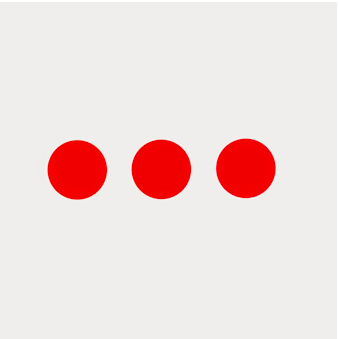
So, let’s look at example number two. In this box are three different red circles (borrowed from Google Images). But they are NOT all the same! The red on the left is a warm red (yellow hue), the center red is a true red (equal amounts of blue and yellow) and on the right is a cool red (containing more blue hue).
Ok Tamar, I get it. But what does that mean for my tichels? Well, going back to skin coloring, someone with warm undertones will have more yellow hue in their skin. Someone with cool undertones will have more pink hue. (Again, your skin tones aren’t just talking about the shade of your skin!) To find out which category you fall into, do the veins check, the metal experiment, or the fabric test. Then, find a color that falls into your color category and go rock your tichel.
Ready to take this up a notch?
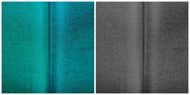
Here are two wrapunzel teal pashminas. The scarf called Andrea’s Teal is on the left and “Rivka Malka’s Teal is on the right. These scarves were initially named somewhat ironically, because Andrea recently confided in me that she somewhat prefers Rivka Malka’s Teal and doesn’t even own her namesake. I wasn’t surprised by this at all! Why? Well, if you look at the grayscale on the right side of that image you’ll see that the tones are pretty similar, it’s the hues that are different. Andrea’s Teal, it’s actually considerably more yellow that Rivka Malka’s Teal. In comparison, Rivka Malka’s Teal has a blue hue.
Next, let’s look at a close up picture of Andrea (sorry for putting you in the hot seat Andrea!)

Andrea’s skin undertones are mostly cool. The more blue teal scarf (right photo) therefore looks better on her than the slightly more yellow version (left).
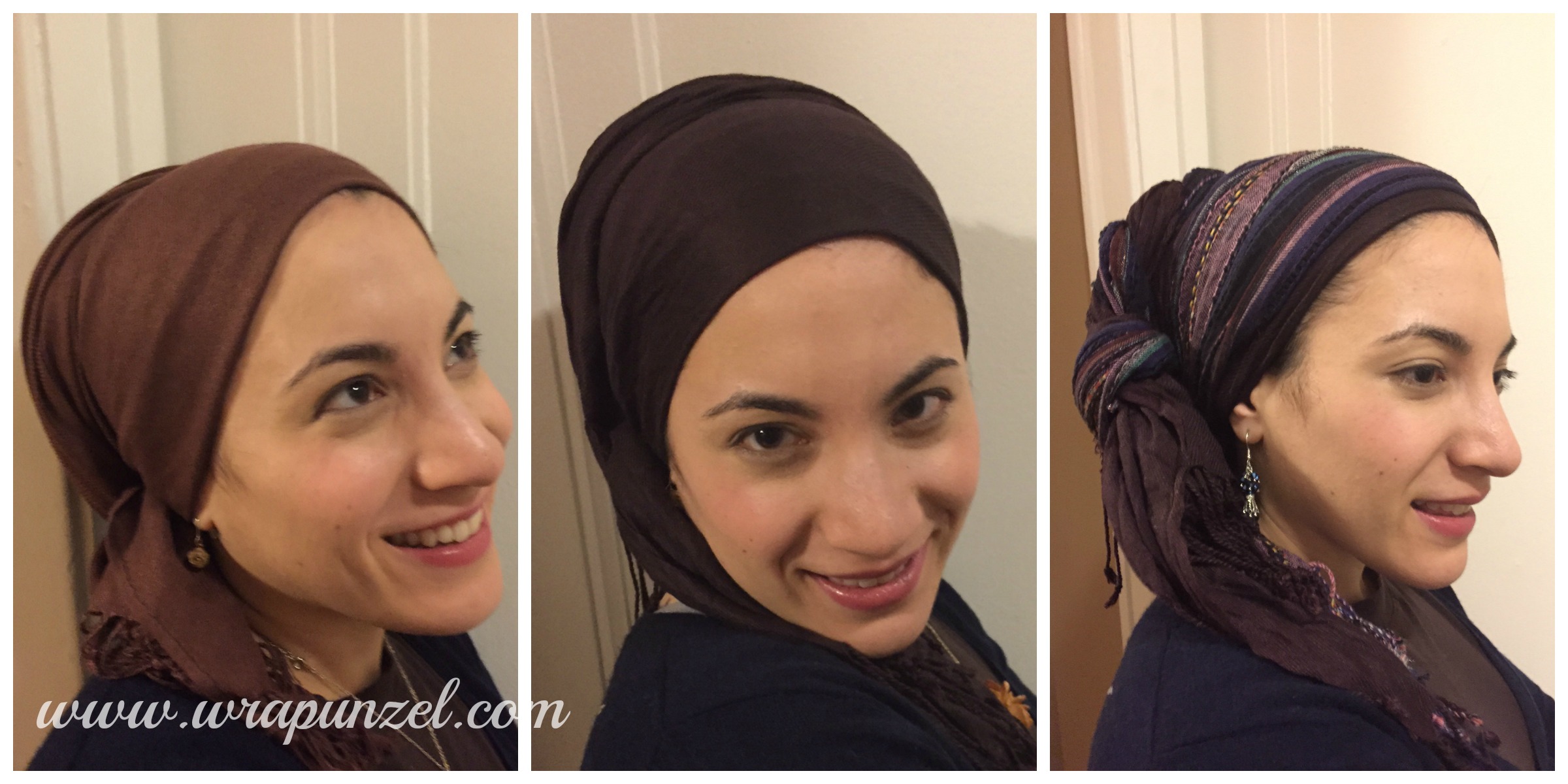
Now, let’s look at a situation where the hue is the same, but the tone is changed.
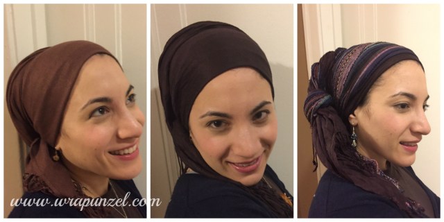
The tichel on the left is considerably lighter. The one in the middle is a darker shade. The hue is the same on the two tichels but I look “washed out” in the lighter shade. When I paired the middle pashmina with a New York Brights my skin color looked great (ok, ignore the lack of makeup and the bad lighting in the hallway. The things that I do for you guys…)
I could also title this particular photo, why I can’t wear baby pink, but Andrea can. Why? Well, although I’ve got a cooler hue (which supposedly allows for baby pink) my skin tone is too dark for that color. Baby light pink blends in with my skin tone and my hue. Monochromatic skin and tichel schemes are always a VERY BAD IDEA. (Please note: there is no photo to portray this particular issue. Although I love Wrapunzel, even I am not willing to sacrifice that much of my vanity. Moving on…) Andrea is an ashy blond and her skin falls in a totally different skin tone category from mine. So, she can wear those lighter, cooler colors whereas I’ll become instantly jaundiced.
Now, I want to stress that this does NOT mean that there aren’t cool or warm color groups. Even a warm blue is still going to be much cooler than a shade of orange! But the subtle differences can wreck havoc with the warm-and-cool color scheme, and when it comes to tichels (and also makeup, this also makes a HUGE difference in makeup – if you want to hear more about makeup let me know and I’ll come up with a post!) the devil is in the darn details.
See you all next time!
Tamar Adina
Share share share!! Help others shine from the inside out!


 First, we have Stephanie in her Wrapunzel tutorial debut (Remember her from our most recent Lady Wrap Star
  At the other end of the spectrum, we have the triumphant return of Jasmin and her stunningly glamorous shimmery wrap! This seemingly effortless (it’s not as complex as it looks, I swear!) and creative style is perfect for the woman who loves intricate-looking wraps without tails (myself included).


![IMG_5043[1]](https://i0.wp.com/wrapunzelblog.com/wp-content/uploads/2016/03/img_50431.jpg?w=309&h=430&ssl=1 "IMG_5043[1]")
![IMG_5063[1]](https://i0.wp.com/wrapunzelblog.com/wp-content/uploads/2016/03/img_50631.jpg?w=323&h=430&ssl=1 "IMG_5063[1]")